Like every self proclaimed expert, I love to have my expertise validated with a request for consult or counseling in my area of choice. When Hélène Magnússon emailed me asking to help her identify the origin of some gloves and mittens she’d seen in an Icelandic museum, I was flattered, and happy to help. I can’t confirm from a photograph where a particular piece was made, or when, but I can tell from the style and construction details what knitting tradition inspired its creation, and that was sufficient info for Hélène.
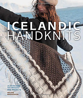 As thanks for helping her confirm Selbu as the source for some of the items that inspired her, Hélène sent me a promotional copy of her new book, Icelandic Handknits. And it’s a gorgeous book. Hardback, full glossy pages, rich, full color, I love the sensual aspects of books; I think that’s why I prefer publishing on paper myself, and rarely read anything longer than a news article or blog post on my digital devices.
Later, when she asked, I was only too happy to write a piece for her blog tour.
Many book reviews are elevated levels of metadata about the book. Who wrote it, who that author is personally, where they came from, how big the book is, what’s inside. Which designs are the reviewer’s favorites. I wanted to do something different. As a designer, I need to know how my work affects the reader. I’m well known for my love of traditional design, and I found many projects I’d love to make for myself. For this blog tour I decided to review the book as a knitter, not another designer, and think about what I wanted to knit first. I chose three projects, marking their places in the book with sticky notes.
Many of the designs are, expectedly, knit in lopi, the Aran weight staple of Icelandic knitting. I have a considerable yarn stash, but lopi is too hot and heavy for Seattle. I’d need to substitute.
A methodical stash dive was called for.
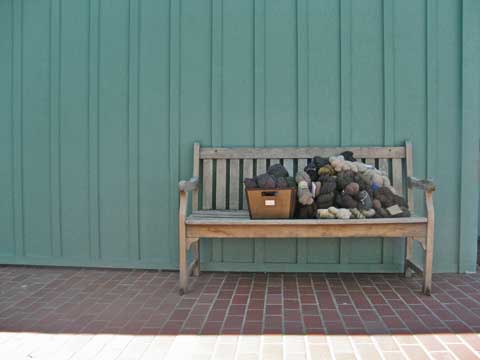
A few years ago I bought the white plastic grid racks you see in many yarn stores, and I organized my stash by color. I knelt down on the floor in front of the racks and pulled solid colored Aran and worsted weight wools and wool blends onto the floor in a big pile.
Within fifteen minutes I had a wide range of brands of yarn to choose from. But the choices were limited: almost all of the yarns that met the weight and color requirements were natural wool colors; browns, greys, creams, white. All neutrals, not a spot of color anywhere. A sea of bland; an ocean of Pay No Attention To Me. I am not here. You can’t see me: I’m invisible. Color informs and reflects our emotion. I bought those yarns. What did that selection say about me and my state when I purchased them? Was I looking at my own self hatred, depression, disappointment in a life turned sideways from where I wanted it to go?
And what does it say about me as a designer? I have a reputation, I think, ( I hope) of creative and inspired use of color. I buy yarns for work in brilliant shades. When I started doing the stranded stuff, I bought one ball of every shade of Rauma Finnullgarn. That’s a hundred balls of yarn. It’s a lot of yarn. I mix purples with olives, teal and orange, yellow and orange and red and green. But when it comes to my own private stash, all I can come up with is baby shit brown?
There must be some mistake. Clearly a change would be in order. I can’t just have brown and grey and cream and black and maybe a touch of blue or red now and then. I have a reputation to maintain. I am A Professional.
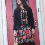
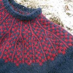
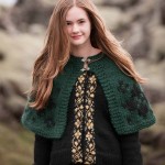
Then I looked at the book again, with its gorgeous four color, glossy photographs of beautiful, windswept people, in a beautiful, windswept environment. Colors are rampant: vivid green fields, blue skies reflected on water and ice, a red door. The garments, though, tend to stay neutral in color, with vivid highlights, styled with colorful accessories. Look at the ladies cardigan Skautbuningur on page 60, styled with a bright cotton print dress, against that red door, is black with an old gold patterned border. The one Lopi sweater, modeled in a man in page 74. Navy blue with a simple red checkerboard at the yoke.The Motull capelet on page 66, which my imagination repurposes in scarlet with a hood, is deep forest green and a black border pattern.
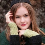
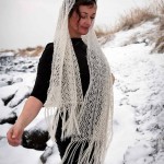
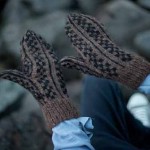
Even accessories such as scarves, shawls, mittens, and socks are neutral colored; Bright shades seem restricted to borders or cuffs, or hidden inside in shoes.
Back to the material. By this time I’m a nervous wreck. I am clearly in deep psychological distress, because I have a pile of brown and grey and cream yarn in front of me. I scan through the photos of old costumes. Hélène selected those photos, with the help of her editor and art director. My inner expert pipes up. It’s not me: this a reflection of Helene’s state when she designed the projects. She must, by my logic, also be in deep psychological distress. Is she depressed and filled with self loathing? Is that all that brown can mean? Or is this color choice reflective of the traditional Icelandic clothes which provide the inspiration for the book? I have to consider that her filter is always in place, when looking at the focus piece of the photo, but I might get past it by looking at what’s in the background.
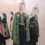 Sure enough, the traditional costumes are dark or natural colored. An occasional red plaid skirt, a paisley shawl.
So then I look back at my own yarn selection and by some miracle I step back from my perspective. I find some scrap of objectivity. Why am I dissatisfied with the selection that follows the designs in the book? Why did I remember the designs as brightly colored, and think it was my yarn selection that was faulty? Is there anything at all RIGHT with me? Is it me? Is it you? How can I tell the difference?
Clearly I’m thinking too much about my yarn colors.
I’m composing this post on my iPad, in a coffee shop, and I wonder now about the clothes we look at and the clothes we wear. Aside from the employees, who wear a uniform, only two people are wearing vivid colors, and I am not one of them. Both of them are men, and both of them are in tee shirts and jeans. Other colors on other patrons are muted; black, lavender, grey, dusty coral, soft blues. Textural emphasis replaces color in some outfits; a tweed, a heather, softly toned plaid. This is a fishing village, and the people are wearing comfortable, soft, easy care clothes. I am the most formally dressed person here, in brown leggings and a hand knit silk and kid mohair yoga dress, knit circularly from the top down. There’s a bow on the left shoulder.
In the past, people wore something much more like a uniform than we’d be satisfied with. The traditional women’s costumes in the book all follow the same format: white blouse, black bodice and skirt, colored apron. Each piece may be, or may not be, decorated with embroidery or colorful trim. Modern western people expect to be able to pick and choose their wardrobe from a wide range of styles, shapes, and colors. The wardrobe is a personal expression, and we want to express something different every time we get dressed. Today I wear a yoga dress, but tomorrow I might wear a top inspired by a Victorian corset, and the day after I might wear an ancient Grecian style full length dress. Or maybe I’ll go with jeans, boots, and a leather jacket to express my tough side. All of history is open to me as a starting point. Fashion is a language, and I want to say a lot, even if I don’t know exactly what it is that I’m saying.
It wasn’t always so complicated.
With all of those choices, however, when I look around, I see people all wearing the same basic thing: jeans, a tee shirt, and some kind of jacket. Low shoes. Women may carry a handbag. Some older women accessorize with a scarf or long decorative necklace to draw the eye away from a softer, fuller figure that is currently unfashionable.
My panic subsides. Maybe it’s not me, or at least not in the way I was thinking in the moment I looked at my yarn pile and saw a pile of baby poop colored yarn. And then it comes back in a new form. Am I really so insecure that I think I can be reduced personally, emotionally, spiritually, intellectually, philosophically, to a single idea, represented by a single color? I’m stuck in a recursive loop: do I see what I see, or do I see what I think you’ll feel about what I see, and judge myself accordingly?
In the end, what I see and what I create is a reflection of some element within myself. When I work from my own creative source, aware of my self limitation and criticism – did I pick the right yarn – and looking past the focus to the real subjection my mental photography’s background, I’ll produce something authentic.
What’s wrong, after all, with my collection of natural colors yarns? Many of them are farm yarns, purchased directly from small local producers, that money going right back into their farm to produce next year’s crop. They’re undyed, minimally processed, with the rich hand and scent of the land and creatures that produced them. The colors are muted, but each has a subtle texture different from the others: one crisp Romney would make perfectly formed, neat stitches with strict definition. Another unspecified wool has a modest but nubby tweed. Still another wool blended with alpaca rises up with a subtle halo. They are beautiful. I love my brown and grey and cream yarns. I love how they make me feel; they take away the hard edge of emotion. They’re a visual buffer, a layer of padding between me and the emotional armor that life as an adult forces me to wear, out of sheer self preservation.
It’s freaking yarn. It’s not the end of the world. It’s just yarn.
I look around at the modern world, full of bright colors and perfect manufactured goods, and everything seems to fit within a perfectly fitted space, and I can’t find a space for myself at all. Maybe my selection of natural farm yarns reflects a desire for more quiet, more authenticity than I see sitting on this busy intersection. Our eyes and brains evolved in a natural environment of grey stone and brown earth and green field and blue sky, and the brightest hues in nature tend to be as sparingly visible as the scarlet or amber trim on those old clothes in the museum. Even at the height of the season, a field of tulips here in the Skagit Valley is still mostly brown soil, green stems, blue sky, and a stripe of red, yellow, orange, or purple.
Colors affect us, physically and emotionally. It’s not my opinion, it’s established scientific fact. Maybe what Hélène and I are both reflecting is a desire for a more natural lifestyle, in the shades that time evolved our eyes and brains to expect. Maybe my brown yarn yarn is where some self protective instinct kicked in, unannounced, to shield me from a too-bright modern world. My jangled nerves need soothing.
This is where my reading of a knitting book takes me: through the materials and back to myself.
What’s on your needles?




I think you have a point! Rethinking my own buys and knitting works … Food for a book! I’ve been going trough a lot of emotions last 2 years and even the time without ANY emotion I can see in my boughed yarn, my weaving, my photographs …
Very interesting, Terri. My first reaction was love for the natural, minimally processed yarn, but I can see how you might have had a visceral reaction about color and the desire for vibrancy. Finding the right balance *for you* is the key, isn’t it? As a designer I’ve been drawn to neutral/natural colors with a pop of color lately. I’m going to seek out Hélène’s book.
What a metaphysical approach of knitting ! I’m not sure that my english is good enough for I could understand everything… I’m a big fan of Helen’s designs, and I hope I’ll be soon able to discover her lovely book.
I’m also very happy to discover your universe !
Hi Terri,
Interesting that I just happened upon your blog a month after you decided to repost (March 2016).
I just read your article about the use of muted colors, perhaps because our brains are wired that way. I felt pretty much the same way, having grown up in the mid-west of the U.S. in the ’60’s and ’70’s. I wore a lot of browns and blues with my jeans, and usually the only color was the bits of embroidery which I’d added.
In college in the 70’s, I was doing a lot of “hippie” stuff like making my own pottery. Looking back on those items, I see a lot of the same color palette: creams, browns, blues… I didn’t get into art history and oil painting until the early 90’s as an “older college student” and it was only then that I gave myself “permission” to begin using actual, real, vibrant colors. Of course, it didn’t hurt that many of my art history heroes, like Paul Gauguin, used a lot of color in their paintings.
I’ve only recently (2011) gotten into crochet, but I’ve noticed that the most common comment I’ve received is that my use of color combinations is greatly admired. Don’t get me wrong. I’ve also done my share of neutral-color pieces. But while those are technically well done, they don’t get the same attention or awards as the bolder pieces. As a matter of fact, those neutrals are the pieces which are lucky to get even an “Honorable Mention” ribbon.
It may be worth noting that as a culture, we ‘commoners’ don’t like to stand out too much, which is why we wear mostly neutral colors. Those who wear bold colors and/or bold fashions are expected to stand out in some other way, also. Either that person is a leader or represents some other aspect of perfection, such as the perfectly toned, beautiful model. As a wall flower myself I understand the concept, and I don’t normally like to draw attention to myself by wearing cutting edge or brightly colored clothing.
My only exception to this rule was during the 80’s when I was in advertising and had both the figure and the finances for wearing clothing which stood out a bit more. Even so, I didn’t go in for the outlandish styles. So even during my more self-confident period, I still exercised some restraint.
What does that say about us when we limit our use of vibrancy to objects which we don’t intend to wear on our person? Or only use minimally as an accessory? Are we so wrapped up in what others might say detrimentally? For me the answer, sadly, is ‘yes’ when it comes to what I put on my own body. What has changed? I’ve gotten older and a bit wider…
I still crochet some vivid pieces, but in my mind, they’re to be worn (theoretically) by someone more daring than myself. Rather than painting with oils, I now ‘paint’ with yarn.